
Banknotes
Information Design
Project by Marcel Pace, Marcel Bruschi, Gabriel Jacobi, Mauricio Perin
The purpose of this essay is to analyze banknotes through methods of graphical analysis. Foi desenvolvido como projeto acadêmico e ao final, além das análises apresenta o redesign de uma das cédulas.


The Process
Graphic Analysis
The graphic analysis' model for banknotes was designed and applied based on the models and criteria from the authors: Ashwin, Bertin, Horn, Mijksenaar, and van der Waarde.
But the most significant contribution was David Skopec's layering method.
David Skopec presents in his Digital Layout book a method to analyze the disposition of elements in such layouts — and we expanded this idea to print media. The method consists of splitting the media into areas according to its content or meaning, each of them receiving a different color.

After this deconstruction and simplification into areas of information from a large number of samples, all of them are overlapped. This overlapping generates an optimized visualization of the location of the elements through the colors, similar to a heat map.

Based on the former authors, we divided a banknote into several graphic elements, assigning different colors to them (value - number, value - verbal, name, origin, and main decorative element).

The method was also used for the background, or area with texture.

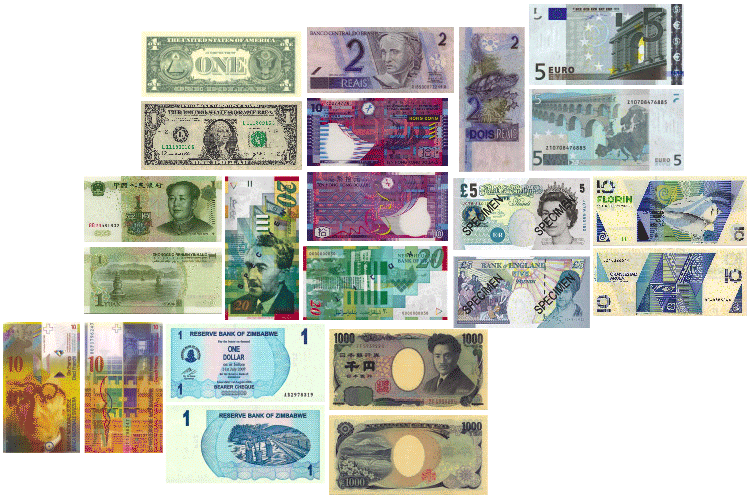
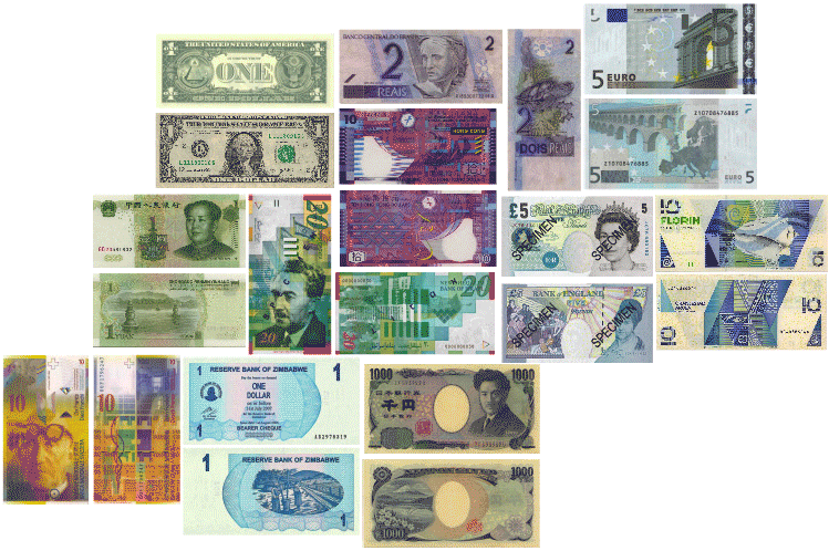
Sample
More than 150 banknotes were initially studied, and 11 of them were selected based upon their graphic relevance, global or local economic relevance, the banknote of the least amount and still in production, among others.

Results
The descriptive analysis was compiled into a spreadsheet:

The analysis of the visual elements was applied in all of the samples:
Which were overlapped:

Front layering

Back layering
The same method was applied to the areas of texture:
And the overlapping:

Front layering

Back layering
Redesign
All the analyses enabled us to identify the best practices for the design of a bankonte. With that in mind, we applied all the requirements in a redesign of the Dolar, the most used currency and yet with the most discrepancies from the rest of the sample.

Original design


Visual planning considering the requirements

Dolar banknote redesign
References
ASHWIN, C. 1979. The ingredients of style in contemporary illustration: a case study. Information Design Journal 1:1
BERTIN, J. 1983. Semiology of graphics: diagrams, networks, maps. Translated by William J. Berg. London: The University of Wisconsin Press
HORN, R. E. 1998.Visual Language: global communication for the 21st century. Bainbridge Island, Washington: MacroVU, Inc
MIJKSENAAR, P. 1997. Visual Function: an introduction to information design. Rotterdam: 010 Publishers
SKOPEC, D. Digital Layout for the Internet and Other Media; AVA Publishing SA, 2003.
VAN DER WAARDE, K. 1999. The graphic presentation of patient package inserts. In H. J. G. Zwaga, T. Boersema & H. C. M. Hoonhout (Eds.), Visual Information for everyday use: design and research perspectives. London: Taylor & Francis, pp. 75-81