
Resonances
Editorial Design
Project by Marcel Pace, Juliana Stinghen
Resonances is a magazine/teaching material made as volunteer work for the PBMIH, a program that teaches Portuguese to refugees. It is offered by the Portuguese Language and Linguistics course at the Federal Univerity of Paraná, maintained by UN's High Commissioner for Refugees.
Published as a digital and printed magazine, Resonances is a compilation of the main classes of the program. It can be used for free by anyone teaching Portuguese for refugees, in any Portuguese-speaking country.
Each class encompasses three different materials: a didactic guide for the class, the teacher's material, and the student's material.
You can access the magazine official scientific publication here.
The Process
The name Resonances was given by the client, a great starting point since this property of the wave has a strong visual representation, enabling a solid graphical representation.
The Chladni plates patterns and the Camerata Lausanne visual identity were used as good visual references.
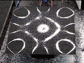
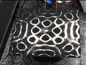
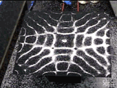
Chladni plates experiment

Camerata Lausanne visual identity

Visual Design
All the visual references benefit from the strong contrast between black and white,light and shadow. But the use of vivid colors was a requirement from the client — red in particular.
With that in mind, we used a complementary color palette since it has the highest contrast possible between colors.
A tone of red and its complementary color, cyan.
The logotype was designed with the concept of resonance in mind.
.png)
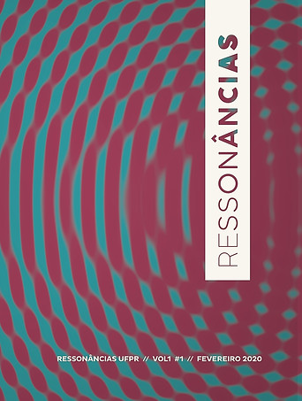
But the strongest material designed was the magazine's cover and the chapter openers throughout the material.
The cover was intentionally designed with a concentration of red on one side, ending with a concentration of cyan on the other side. This was reflected in the chapter openers as well, starting with red and slowly transitioning to cyan, in order to give a sense of transition for the reader and represent the development of the chapters (basic, intermediate and advanced).

Cover and back cover
The printed version got a UV varnish with shine treatment.

Chapter openers:

Presentation

Classes (intermediate)

Introductory article (prelude)

Classes (advanced)

Classes (basic)

Classes (counterpoints)

Concluding article (reverberations)

Lastly, a visual pattern was also designed to be used in various framing and zoom levels throughout the material.
Layout
The magazine begins with the opening chapters (expedient and summary), the presentation, and an introductory article (preludes).


The Portuguese classes ate the body of the material, going from basic, to intermediate, to advanced, with a bonus section for thematic classes (counterpoints). Each class start with the didactic guide, then goes to the teacher's material, and ends with the student's material.


Student's
material
Didactic guide
Teacher's material
And it ends with a closing article.


Other Deliverables


Small legislation booklet with cover/backcover

Magazine release poster

Stamp